Red Rover is about lowering the barriers to connection and engagement. We set out to make something simple that would help.
Pushing this forward, we’re about to release Red Rover 1.2, with a new design.
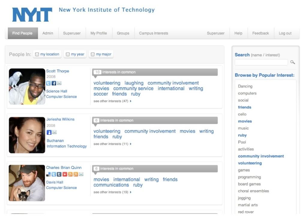
Important changes:
+ It looks better, which makes it feel better to use.
+ We’ve switched from “% Interest Match” match to “8 Interests in Common” this is easier to understand. (No math required.)
+ Profile Pictures are bigger. (Pictures are a HUGE thing for community feel.)
Red Rover logos are very tiny. (Just woke up one day and decided to be more humble.)
+ Social connection and tools (FB, Twitter, Blogs, Delicious, are featured next to profile pictures.)
+ Simplified sign-up process.
+ Plus many other small changes.
And now the bad news: admins, we love you, but we love your students
more. That means you’re getting stuck with the old designs with the
views that only you see.
Please don’t take it personally. We’ll tweak your views as well, right after we’re satisfied with the student side : )
Sneak Preview: Here’s the new “Find People” page:

