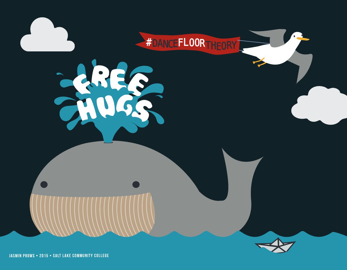
When we started we wanted to make a mark as a company. The goal was to be bigger than just speaking, bigger than the individuals involved, but actually establish a brand that a network could grow with.
So on our early Dance Floor Theory presentation slides, we put our logo:

Every single slide had the same “frame”. It was the “impressions” school of branding – the more times people see our logo, the more they will remember it.
As we gave more presentations and became more confident as a company, we realized that our logo and colors were just obnoxious visual clutter that actually took away from the point of learning.
So for six months or so, we’ve been redoing all of our slides, ditching the logos.
It’s the “experience” school of branding. Forget impressions. People don’t pay attention to what they don’t care about. Deliver on your promise. Deliver a great experience. Then show the logo – if you did your job well, people will care and want to remember you.

Doesn’t that feel better?
Plus, and importantly, I think it works better on all counts. The education is better (priority one) and the branding is better (priority 7-8, but still important).
Other improvements:
– Ditched the text, redundant, unnecessary.
– Went to HD format. This one is a little weird. It gives us more room, sure, but it also leaves letterboxes on most screens because most are not 16:9. Letterbox is silly design wise, but the connotative meaning is of quality. It’s subtle, I’m not sure it’s a good argument, but students have commented on it and all have put it in the “badass” category. It also makes it easier for us to edit slides into our videos, which are all HD now.
It’s the little things that show growth. We’re learning, getting more confident and better at our jobs. A good direction.


