Bad interface is a huge pet peeve. Ever since I read Interface Culture* a few years ago the idea of someone adding extra confusion and disorientation to our disorientating world bothers me.
Enter the US Government.
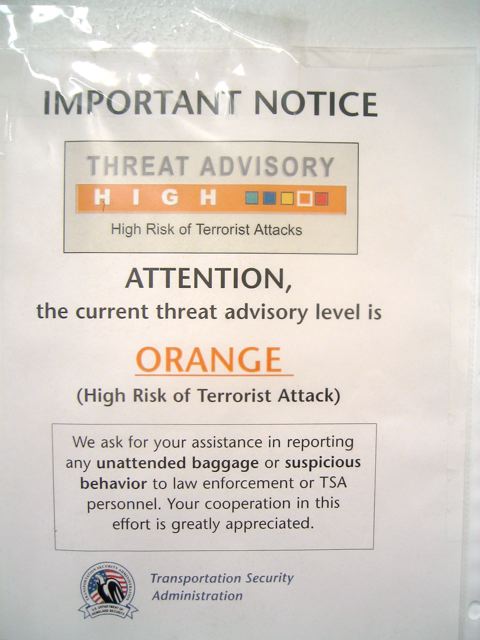
I travel all the time and every airport in the country has some version of this sign all over the place:

It hasn’t changed since August of last year when it was briefly moved to red after the british plot.
Every time I’m in an airport I’m reminded of simply this: HIGH RISK.
What, exactly, is this colored, 5-level interface helping me
navigate? Is it simply my level of fear and awareness? If turning up and down my level of awareness is the goal, wouldn’t it be important to change it more than once a year?
Raise your hand if you think this will be green in your lifetime.
This particular interface, setting out to control my level of anxiety and fear-tinged awareness, just makes me angry. Then sad.