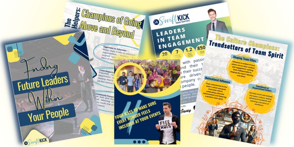
Whether promoting your club’s next big event or recruiting new members, creating eye-catching flyers and posters is key to grabbing attention on campus. Here are ten essential tips to help you design flyers and posters that stand out and effectively communicate your message.
1. Clear Messaging is Key
First things first, your flyer or poster should communicate your club or event’s purpose clearly and succinctly. Avoid jargon and get straight to the point so students know what you’re offering.
2. Eye-Catching Design
Catch the eye of passersby with bold colors and engaging visuals. A visually appealing design can draw people in and make your flyer stand out in a sea of announcements.
3. Hierarchy of Information
Organize your content in a clear hierarchy. Important details like event date, time, and location should be prominent and easy to find at a glance.
4. Strong Call to Action
Every effective flyer or poster should include a compelling call to action. Whether “Join us for our first meeting!” or “Visit our booth at the Student Union,” make it clear what you want your audience to do next.
5. Maintain Brand Consistency
Consistency is key in building recognition. Use your club’s logo, colors, and fonts consistently across all promotional materials to reinforce your brand identity.
6. Choose Readable Fonts
Opt for fonts that are easy to read from a distance. Avoid overly decorative fonts that may hinder readability, especially when your flyer or poster is viewed from afar.
7. Embrace Whitespace
Whitespace isn’t wasted space—it helps your content breathe and makes your flyer easier to read. Keep your design clean and uncluttered to maximize impact.
8. Use Inclusive Language and Imagery
Ensure your flyer or poster is inclusive and welcoming to all students. Use language and imagery that reflects the diversity of your campus community.
9. Integrate Social Media
Connect digitally by including your club’s social media handles or QR codes. This allows students to engage further and stay updated beyond the flyer or poster.
10. Double-Check for Errors
Before printing, proofread your flyer or poster for spelling and grammatical errors. A polished final product shows professionalism and attention to detail.
11. BONUS: Use Canva
Our Community Manager, Sami, would say that Canva is her favorite platform to use when it comes to design. Canva offers a vast library of photos and designs to use. It allows storage and editing of your own photos (her personal favorite feature), and you can customize your design with inspiration from the existing templates, making it the perfect platform.
And that’s it! With these 10 tips in your toolkit, you’re well-equipped to create flyers and posters that captivate and inform. Remember, effective design isn’t just about aesthetics—it’s about communicating your club’s mission and events clearly and persuasively.
So, go ahead, get creative, and let your club’s personality shine through your next promotional materials. Here’s to spreading the word and growing your club’s reach on campus!


